About the project
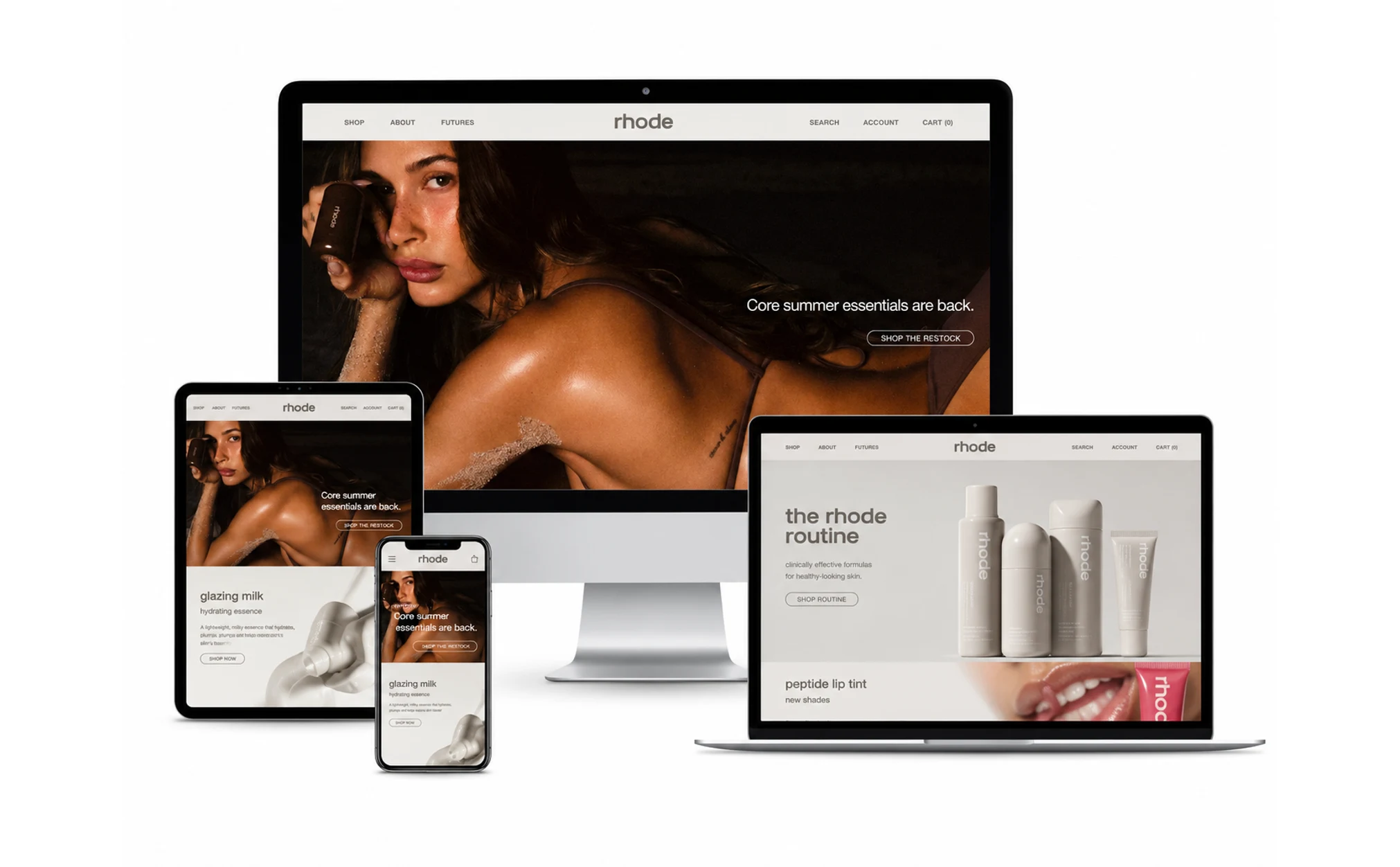
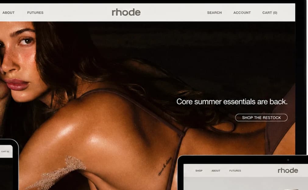
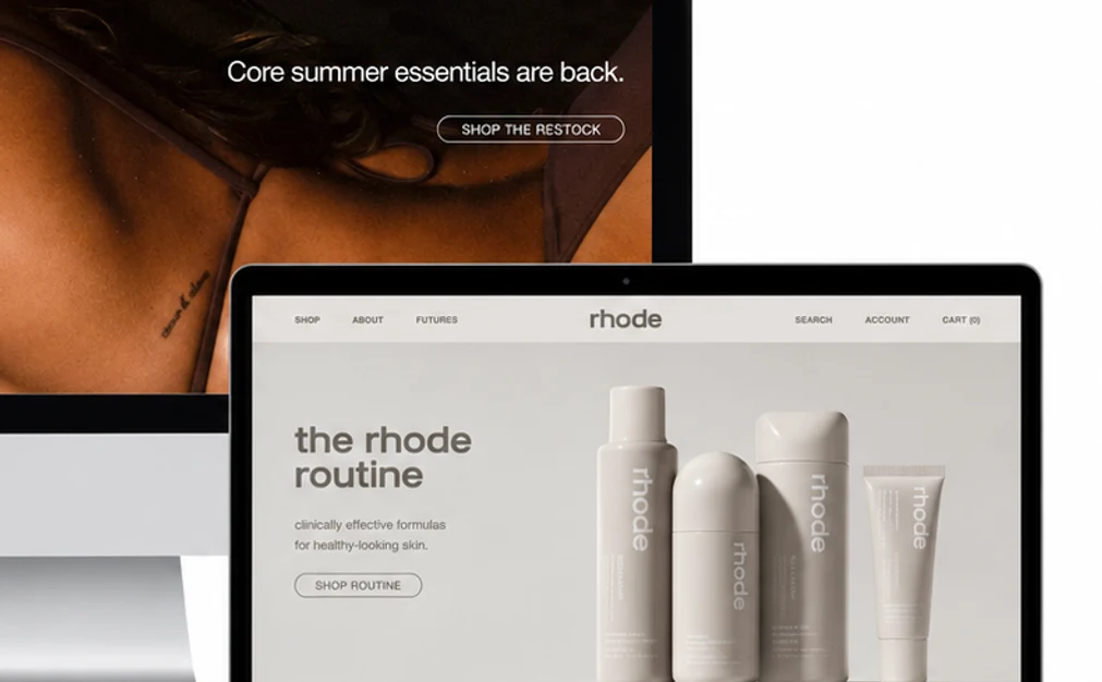
rhode entered the European market with a deliberately small range: four products, one routine. The brief was unusual for e-commerce — do less. No badges, no countdown timers, no cross-sell carousel under the fold. We built a storefront where a product page is a single scroll with three sections: what it is, how it feels, how to use it. Every image is the product or the skin, never a lifestyle stock shot. The routine page sequences the four products into one flow, which is what most first orders now follow.
Gallery
What we did
Design
Two typefaces, four colours, and a grid that lets images breathe. The routine page is the only place where all four products appear together, which makes it the natural entry for new customers.
Development
Static storefront with an edge-cached cart, built to survive a launch-day spike without a queue. Image delivery is AVIF-first with a hard budget: no page ships more than 900 KB of imagery.
Advertising
Launch campaign across Meta and TikTok built on product-only creative, with the routine page as the single landing target. Creative was refreshed weekly for the first six weeks, then monthly.
Results in numbers
0.8 s
time to interactive on 4G
+46%
add-to-cart from the routine page
4
products, one routine
96
Lighthouse performance on mobile
What they say about us
Every agency we spoke to wanted to add something. This was the only team that argued for taking things out, and then proved it with numbers after launch.
Services used

Your contact person
Miriam Kraus
I read every request personally and get back to you within one business day.